Os dados
Para coletar os dados de outros países, foram utilizadas as APIs dos sites:
[1]:
import requests
import pandas as pd

covid_api = 'https://corona-api.com/countries/'
rest_countries = 'https://restcountries.eu/rest/v2/alpha/'
country = 'CN' # Alpha-2 ISO3166

data_json =  requests.get(covid_api + country).json()
country = requests.get(covid_api + country).json()

N = country['data']['population']

print(country['data']['name'])
China
Organizando os dados
[2]:
from datetime import datetime

df = pd.DataFrame(data_json['data']['timeline'])
df = df.sort_values('date').reset_index()

from datetime import datetime, timedelta
df['date'] = [datetime.fromisoformat(f) for f in df['date']]
df = df.drop_duplicates(subset='date', keep = 'last')

# Criando o vetor de tempo
first_date = df['date'].iloc[0]
size_days = (df['date'].iloc[-1] - df['date'].iloc[0]).days
date_vec = [first_date + timedelta(days=k) for k in range(size_days)]

new_df = pd.DataFrame(date_vec, columns=['date'])
new_df = pd.merge(new_df, df, how='left', on= 'date')
new_df = new_df.drop(columns= ['index',  'updated_at', 'is_in_progress'])

for col in new_df.columns[1:]:
    new_df[col] = new_df[col].interpolate(method='polynomial', order=1)
df = new_df.dropna()

df.head()
[2]:
| date | deaths | confirmed | active | recovered | new_confirmed | new_recovered | new_deaths | |
|---|---|---|---|---|---|---|---|---|
| 0 | 2020-01-21 | 17 | 548 | 503 | 28 | 548 | 28 | 17 |
| 1 | 2020-01-22 | 18 | 643 | 595 | 30 | 95 | 2 | 1 |
| 2 | 2020-01-23 | 26 | 920 | 858 | 36 | 277 | 6 | 8 |
| 3 | 2020-01-24 | 42 | 1406 | 1325 | 39 | 486 | 3 | 16 |
| 4 | 2020-01-25 | 56 | 2075 | 1970 | 49 | 669 | 10 | 14 |
Visualizando os dados
[3]:
from bokeh.models   import Legend, ColumnDataSource, RangeTool, LinearAxis, Range1d, HoverTool
from bokeh.palettes import brewer, Inferno256
from bokeh.plotting import figure, show
from bokeh.layouts  import column
from bokeh.io       import output_notebook

output_notebook()

import numpy as np

# Criando os valores para legenda no plot
year =  [str(int(d.year)) for d in df['date'] ]
month = [("0"+str(int(d.month)))[-2:] for d in df['date'] ]
day =   [("0"+str(int(d.day)))[-2:] for d in df['date'] ]

# Criando a fonte de dados
source = ColumnDataSource(data={
    'Data'       : df['date'].values,
    'd': day, 'm': month, 'y': year,
    'Infectados Acc' : df['confirmed'].values,
    'Mortes'     : df['deaths'].values,
    'Ativo'     : df['active'].values,
    'Recuperados': df['recovered'].values
})


# Criando a figura
p = figure(plot_height=500,
           plot_width=600,
           x_axis_type="datetime",
           tools="",
           #y_axis_type="log",
           toolbar_location=None,
           title="Evolução do COVID - " + country['data']['name'])

# Preparando o estilo
p.grid.grid_line_alpha = 0
p.ygrid.band_fill_color = "olive"
p.ygrid.band_fill_alpha = 0.1
p.yaxis.axis_label = "Indivíduos"
p.xaxis.axis_label = "Dias"

# Incluindo as curvas
i_p = p.line(x='Data', y='Ativo',
             legend_label="Infectados",
             line_cap="round", line_width=5, color="#c62828", source=source)
m_p = p.line(x='Data', y='Mortes',
             legend_label="Mortes",
             line_cap="round", line_width=5, color="#512da8", source=source)
c_p = p.line(x='Data', y='Infectados Acc',
             legend_label="Infectados Acc",
             line_cap="round", line_width=5, color="#0288d1", source=source)
r_p = p.line(x='Data', y='Recuperados',
             legend_label="Recuperados",
             line_cap="round", line_width=5, color="#388e3c", source=source)

# Colocando as legendas
p.legend.click_policy="hide"
# p.legend.location = "top_left"
p.legend.location = "top_left"

# Incluindo a ferramenta de hover
p.add_tools(HoverTool(
    tooltips=[
        ( 'Indivíduos', '$y{i}'),
        ( 'Data',       '@d/@m/@y' ),
    ],
    renderers=[
        m_p, i_p, c_p, r_p
    ]
))

show(p)
Verificando os dados
[4]:
dif_I = np.diff(df['active'])
cum = []
cum.append(dif_I[0])

for k, i in enumerate(dif_I):
    cum.append(cum[-1] + i)

cum = np.array(cum)
cum += df['deaths'].to_numpy() + df['recovered'].to_numpy()

print("Erro entre casos acumulados e valores de confirmados: {}".format(
        round(sum((cum - df['confirmed'].values)**2 / len(cum)),2) ) )
Erro entre casos acumulados e valores de confirmados: 168921.0
Criando os dados SIR
[5]:
I = df['active'].to_numpy()
R = df['recovered'].to_numpy()
M = df['deaths'].to_numpy()
S = N - R - I

# Creating the time vector
t = np.linspace(0, len(I), len(I))


Sd, Id, Md, Rd, td = S, I, M, R, t
[7]:
Ro = (np.log(S[0]/N) - np.log(S[-1]/N))/(S[0]/N - S[-1]/N)
print("Calculo do Ro baseado nos dados:", Ro)
Calculo do Ro baseado nos dados: 1.0000300994523579
Estimando utilizando todos os dados
[8]:
from models import *

dataset = dict(S=Sd, I=Id, R=Rd)

# Create the model
sir_model = ss.SIR(pop=N, focus=["S", "I", "R"])

# Adjust the parameters
sir_model.fit(dataset, td,
              search_pop=True,
              pop_sens=[0.00001,0.05],
              beta_sens=[100,10000],
              r_sens=[100,100])


# Predict the model
sim_res = sir_model.predict((Sd[0],Id[0],Rd[0]), td)
         ├─ S(0) ─ I(0) ─ R(0) ─  [1330043469, 503, 28]
         ├─ beta ─   1   r ─   0.14285714285714285
         ├─ beta bound ─   0.01  ─  10000
         ├─ r bound ─   0.0014285714285714286  ─  14.285714285714285
         ├─ equation weights ─   [7.51893117169047e-10, 7.90340642628301e-05, 1.8154828650455473e-05]
         ├─ Running on ─  differential_evolution SciPy Search Algorithm
         └─ Defined at:  5100.406034312756  ─  0.04454555270373974
[9]:
print("Parâmetros estimados: ", sir_model.parameters)
print("Suposto Ro: ", sir_model.parameters[0] * sir_model.parameters[-1] / sir_model.parameters[1])
print("Dias contaminados: ", 1 / sir_model.parameters[1])
Parâmetros estimados:  [5.10040603e+03 4.45455527e-02 6.14351607e-05]
Suposto Ro:  7.034243490574524
Dias contaminados:  22.448930124421754
[14]:
p = figure(plot_height=500,
           plot_width=800,
           tools="",
           toolbar_location=None,
           title="Evolução do COVID - " + country['data']['name'])

# Preparando o estilo
p.grid.grid_line_alpha = 0
p.ygrid.band_fill_color = "olive"
p.ygrid.band_fill_alpha = 0.1
p.yaxis.axis_label = "Indivíduos"
p.xaxis.axis_label = "Dias"

p.line(t, I,
       legend_label="Infectados", color="#ff6659", line_width=4)
p.line(t, R,
       legend_label="Removidos", color="#76d275", line_width=4)

# Show the results
p.line(td, sim_res[1],
       legend_label="Infectados - Modelo", line_dash="dashed", color="#d32f2f", line_width=3)
p.line(td, sim_res[2],
    legend_label="Removidos - Modelo", line_dash="dashed", color="#43a047", line_width=3)
p.line(td, sim_res[0],
      legend_label="Suscetíveis Ponderados - Modelo", line_dash="dashed", color="#1e88e5", line_width=3)
p.add_layout(p.legend[0], 'right')

show(p)
Monte Carlo
Nesta parte, faremos um teste aumentando a quantidade de amostras de treinamento e prevendo o momento do pico da epidemia a medida que mais dias são utilizados para treinamento. Esse estudo vai possibilitar a análise da certeza da previsão do pico da epidemia antes desse acontecer.
[15]:
saved_param = {'r':[], 'beta':[], 'pop':[]}
saved_prediction = []

start_day = 10
pred_t = np.array(range(int(td[-1])))

for i in range(start_day, len(I)):

    dataset = dict(S=Sd[:i], I=Id[:i], R=Rd[:i])
    td_ = td[:i]

    # Create the model
    sir_model = ss.SIR(pop=N, focus=["S", "I", "R"], verbose = False)

    # Adjust the parameters
    sir_model.fit(dataset, td_,
                  search_pop=True,
                  pop_sens=[0.00001,0.05],
                  beta_sens=[100,10000],
                  r_sens=[100,100])

    saved_param['beta'].append(sir_model.parameters[0])
    saved_param['r'].append(sir_model.parameters[1])
    saved_param['pop'].append(sir_model.parameters[2])

    saved_prediction.append(sir_model.predict((Sd[0],Id[0], Rd[0]), pred_t))
/opt/anaconda3/lib/python3.7/site-packages/scipy/integrate/odepack.py:248: ODEintWarning: Excess work done on this call (perhaps wrong Dfun type). Run with full_output = 1 to get quantitative information.
  warnings.warn(warning_msg, ODEintWarning)
/opt/anaconda3/lib/python3.7/site-packages/scipy/integrate/odepack.py:248: ODEintWarning: Excess work done on this call (perhaps wrong Dfun type). Run with full_output = 1 to get quantitative information.
  warnings.warn(warning_msg, ODEintWarning)
/opt/anaconda3/lib/python3.7/site-packages/scipy/integrate/odepack.py:248: ODEintWarning: Excess work done on this call (perhaps wrong Dfun type). Run with full_output = 1 to get quantitative information.
  warnings.warn(warning_msg, ODEintWarning)
/opt/anaconda3/lib/python3.7/site-packages/scipy/integrate/odepack.py:248: ODEintWarning: Excess work done on this call (perhaps wrong Dfun type). Run with full_output = 1 to get quantitative information.
  warnings.warn(warning_msg, ODEintWarning)
/opt/anaconda3/lib/python3.7/site-packages/scipy/integrate/odepack.py:248: ODEintWarning: Excess work done on this call (perhaps wrong Dfun type). Run with full_output = 1 to get quantitative information.
  warnings.warn(warning_msg, ODEintWarning)
/opt/anaconda3/lib/python3.7/site-packages/scipy/integrate/odepack.py:248: ODEintWarning: Excess work done on this call (perhaps wrong Dfun type). Run with full_output = 1 to get quantitative information.
  warnings.warn(warning_msg, ODEintWarning)
/opt/anaconda3/lib/python3.7/site-packages/scipy/integrate/odepack.py:248: ODEintWarning: Excess work done on this call (perhaps wrong Dfun type). Run with full_output = 1 to get quantitative information.
  warnings.warn(warning_msg, ODEintWarning)
/opt/anaconda3/lib/python3.7/site-packages/scipy/integrate/odepack.py:248: ODEintWarning: Excess work done on this call (perhaps wrong Dfun type). Run with full_output = 1 to get quantitative information.
  warnings.warn(warning_msg, ODEintWarning)
[17]:
import pickle

with open("./China_II_mc_runs.pickle", "wb") as handle:
    pickle.dump({"pars":saved_param, "pred":saved_prediction}, handle)
Análise do uso do sistema de saúde
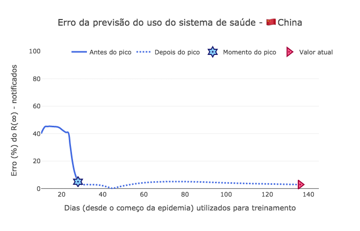
Nesta análise, mostramos o erro percentual do quanto antes do pico, conseguimos prever a quantidade de pessoas que realmente serão identificadas como infectadas, uma vez que \(R(\infty)\) é a quantidade de pessoas recuperadas totais, daquelas que foram noficadas como infectadas no sistema de saúde. Desta forma segue o erro proporcional do erro a medida em que novos dados diários foram incluidos no modelo:
[34]:
x = range(start_day, len(I))
usage_error = [ 100 * abs(p*N - Rd[-1]) / Rd[-1] for p in saved_param['pop']]

fig9 = go.Figure()

fig9.add_trace(go.Scatter(
                    x=td[start_day:peak_pos],
                    y=usage_error[:peak_pos-start_day],
                    mode='lines',
                    name='Antes do pico',
                    line_shape='spline',
                    line = dict(color='royalblue', width=3),
                    hovertemplate="ε(%) = %{y:.0f}, <br> com %{x:.0f} dias de dados."))
fig9.add_trace(go.Scatter(
                    x=td[peak_pos:-1],
                    y=usage_error[peak_pos-start_day:-1],
                    mode='lines',
                    line_shape='spline',
                    name='Depois do pico',
                    line = dict(color='royalblue', width=3, dash='dot'),
                    hovertemplate="ε(%) = %{y:.0f}, <br> com %{x:.0f} dias de dados."))
fig9.add_trace(go.Scatter(
                    mode="markers", x=[peak_pos], y=[usage_error[peak_pos-start_day]],
                    marker_symbol="hexagram-dot", name="Momento do pico",
                    marker_line_color="midnightblue", marker_color="lightskyblue",
                    marker_line_width=2, marker_size=15,
                    hovertemplate="Pico no dia %{x}, com um ε(%) = %{y:.0f}."))
fig9.add_trace(go.Scatter(
                    mode="markers", x=[td[-1]], y=[usage_error[-1]],
                    marker_symbol="triangle-right-dot", name="Valor atual",
                    marker_line_color="#a00037", marker_color="#ff5c8d",
                    marker_line_width=2, marker_size=15,
                    hovertemplate="No dia %{x} da epidemia, <br> convergindo para ε(%) = %{y:.4f}."))
fig9.update_layout(template='xgridoff', yaxis_range=[-1,100],
                  legend_orientation="h", legend=dict(x=0.10, y=1.05),
                  xaxis_title='Dias (desde o começo da epidemia) utilizados para treinamento',
                  yaxis_title='Erro (%) do R(∞) - notificados',
                  title_text="Erro da previsão do uso do sistema de saúde - 🇨🇳 " + country['data']['name'])

fig9.show(renderer="png")
Visualizando as previsões de \(I(t)\)
Vamos analisar as previsões quando somente os dados antes do pico são fornecidos ao modelo, e as previões utilizando os dados após o pico:
[19]:
visual_peak = 30

p2 = figure(plot_height=500,
           plot_width=600,
           tools="",
           toolbar_location=None,
           title="Evolução do COVID - " + country['data']['name'])

# Preparando o estilo
p2.grid.grid_line_alpha = 0
p2.ygrid.band_fill_color = "olive"
p2.ygrid.band_fill_alpha = 0.1
p2.yaxis.axis_label = "Indivíduos"
p2.xaxis.axis_label = "Dias"

# Incluindo as curvas
p2.line(td, Id,
       legend_label="Infectados",
       line_cap="round", line_width=3, color="#c62828")

for data in saved_prediction[visual_peak-start_day:]:
    p2.line(pred_t[:len(td)], -data[1][:len(td)],
           legend_label="Previsão Infectados - Depois do pico",
           line_cap="round", line_dash="dashed", line_width=4, color="#ffa000", line_alpha = 0.1)

for data in saved_prediction[:visual_peak-start_day]:
    p2.line(pred_t[:len(td)], -data[1][:len(td)],
           legend_label="Previsão Infectados - Antes do pico",
           line_cap="round", line_dash="dashed", line_width=4, color="#42a5f5", line_alpha = 0.3)

# Colocando as legendas
p2.legend.click_policy="hide"
p2.legend.location = "top_right"

show(p2)
Visualizando os ajustes dos grupos
Aqui vamos analisar as previsões obtidas para cada grupo \(S(t)\), \(I(t)\) e \(R(t)\), a medida que mais dias foram informados ao modelo.
[26]:
p3 = figure(plot_height=350,
           plot_width=600,
           tools="",
           toolbar_location=None,
           title="Evolução do COVID - I(t) e R(t) - " + country['data']['name'])

p4 = figure(plot_height=350,
           plot_width=600,
           tools="",
           toolbar_location=None,
           title="Evolução do COVID - S(t) - " + country['data']['name'])

plot_all = True

# Preparando o estilo
p3.grid.grid_line_alpha = 0
p3.ygrid.band_fill_color = "olive"
p3.ygrid.band_fill_alpha = 0.1
p3.yaxis.axis_label = "Indivíduos"
p3.xaxis.axis_label = "Dias"

p4.grid.grid_line_alpha = 0
p4.ygrid.band_fill_color = "olive"
p4.ygrid.band_fill_alpha = 0.1
p4.yaxis.axis_label = "Indivíduos"
p4.xaxis.axis_label = "Dias"

# Incluindo as curvas
for data in saved_prediction[20:]:
    p3.line(pred_t, data[1],
           legend_label="Previsão Infectados",
           line_cap="round", line_dash = 'dashed',
           line_width=4, color="#42a5f5", line_alpha = 0.1)

    p3.line(pred_t, data[2],
           legend_label="Previsão Recuperados",
           line_cap="round", line_dash = 'dashed', line_width=4,
           color="#9c27b0", line_alpha = 0.07)


p3.line(td, Id,
       legend_label="Infectados",
       line_cap="round", line_width=3, color="#005cb2")

p3.line(td, Rd,
           legend_label="Recuperados",
           line_cap="round", line_width=3, color="#5e35b1")

if plot_all:
    for data in saved_prediction:
        p4.line(pred_t, data[0] + N*(1-saved_param['pop'][-1]),
               legend_label="Previsão Suscetiveis",
               line_cap="round", line_dash = 'dashed',
               line_width=4, color="#ff5722", line_alpha = 0.07)
    p4.line(td, Sd,
           legend_label="Suscetiveis",
           line_cap="round", line_width=3, color="#b71c1c")

# Colocando as legendas
p3.legend.click_policy="hide"
p3.legend.location = "top_left"

p4.legend.click_policy="hide"
p4.legend.location = "top_right"

show(column(p3,p4))
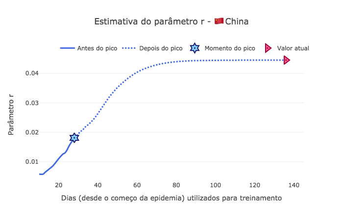
Análise de variação do \(R_0\)
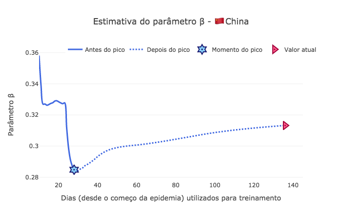
[33]:
x = range(start_day, len(I))
beta_norm = [b*p for b,p in zip(saved_param['beta'],saved_param['pop'])]
Ro = [b*p/r for b,r,p in zip(saved_param['beta'],saved_param['r'],saved_param['pop'])]


fig1 = go.Figure()

fig1.add_trace(go.Scatter(
                    x=td[start_day:peak_pos],
                    y=beta_norm[:peak_pos-start_day],
                    mode='lines',
                    name='Antes do pico',
                    line_shape='spline',
                    line = dict(color='royalblue', width=3),
                    hovertemplate="β = %{y:.4f}, <br> com %{x:.0f} dias de dados."))
fig1.add_trace(go.Scatter(
                    x=td[peak_pos:-1],
                    y=beta_norm[peak_pos-start_day:-1],
                    mode='lines',
                    line_shape='spline',
                    name='Depois do pico',
                    line = dict(color='royalblue', width=3, dash='dot'),
                    hovertemplate="β = %{y:.4f}, <br> com %{x:.0f} dias de dados."))
fig1.add_trace(go.Scatter(
                    mode="markers", x=[peak_pos], y=[beta_norm[peak_pos-start_day]],
                    marker_symbol="hexagram-dot", name="Momento do pico",
                    marker_line_color="midnightblue", marker_color="lightskyblue",
                    marker_line_width=2, marker_size=15,
                    hovertemplate="Pico no dia %{x}, com um β = %{y:.4f}."))
fig1.add_trace(go.Scatter(
                    mode="markers", x=[td[-1]], y=[beta_norm[-1]],
                    marker_symbol="triangle-right-dot", name="Valor atual",
                    marker_line_color="#a00037", marker_color="#ff5c8d",
                    marker_line_width=2, marker_size=15,
                    hovertemplate="No dia %{x} da epidemia, <br> convergindo para β = %{y:.4f}."))
fig1.update_layout(template='xgridoff',
                  legend_orientation="h", legend=dict(x=0.10, y=1.05),
                  xaxis_title='Dias (desde o começo da epidemia) utilizados para treinamento',
                  yaxis_title='Parâmetro β',
                  title_text="Estimativa do parâmetro β - 🇨🇳 " + country['data']['name'])

fig1.show(renderer="png")
[32]:
fig2 = go.Figure()

fig2.add_trace(go.Scatter(
                    x=td[start_day:peak_pos],
                    y=saved_param['r'][:peak_pos-start_day],
                    mode='lines',
                    name='Antes do pico',
                    line_shape='spline',
                    line = dict(color='royalblue', width=3),
                    hovertemplate="r = %{y:.4f}, <br> com %{x:.0f} dias de dados."))
fig2.add_trace(go.Scatter(
                    x=td[peak_pos:-1],
                    y=saved_param['r'][peak_pos-start_day:-1],
                    mode='lines',
                    line_shape='spline',
                    name='Depois do pico',
                    line = dict(color='royalblue', width=3, dash='dot'),
                    hovertemplate="r = %{y:.4f}, <br> com %{x:.0f} dias de dados."))
fig2.add_trace(go.Scatter(
                    mode="markers", x=[peak_pos], y=[saved_param['r'][peak_pos-start_day]],
                    marker_symbol="hexagram-dot", name="Momento do pico",
                    marker_line_color="midnightblue", marker_color="lightskyblue",
                    marker_line_width=2, marker_size=15,
                    hovertemplate="Pico no dia %{x}, com um r = %{y:.4f}."))
fig2.add_trace(go.Scatter(
                    mode="markers", x=[td[-1]], y=[saved_param['r'][-1]],
                    marker_symbol="triangle-right-dot", name="Valor atual",
                    marker_line_color="#a00037", marker_color="#ff5c8d",
                    marker_line_width=2, marker_size=15,
                    hovertemplate="No dia %{x} da epidemia, <br> convergindo para r = %{y:.4f}."))
fig2.update_layout(template='xgridoff',
                  legend_orientation="h", legend=dict(x=0.07, y=1.06),
                  xaxis_title='Dias (desde o começo da epidemia) utilizados para treinamento',
                  yaxis_title='Parâmetro r',
                  title_text="Estimativa do parâmetro r - 🇨🇳 " + country['data']['name'])

fig2.show(renderer="png")
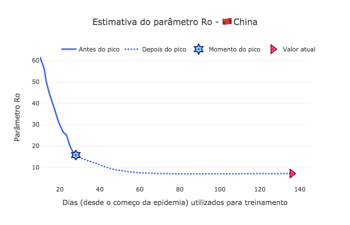
[31]:
fig3 = go.Figure()

fig3.add_trace(go.Scatter(
                    x=td[start_day:peak_pos],
                    y=Ro[:peak_pos-start_day],
                    mode='lines',
                    name='Antes do pico',
                    line_shape='spline',
                    line = dict(color='royalblue', width=3),
                    hovertemplate="r = %{y:.4f}, <br> com %{x:.0f} dias de dados."))
fig3.add_trace(go.Scatter(
                    x=td[peak_pos:-1],
                    y=Ro[peak_pos-start_day:-1],
                    mode='lines',
                    line_shape='spline',
                    name='Depois do pico',
                    line = dict(color='royalblue', width=3, dash='dot'),
                    hovertemplate="Ro = %{y:.4f}, <br> com %{x:.0f} dias de dados."))
fig3.add_trace(go.Scatter(
                    mode="markers", x=[peak_pos], y=[Ro[peak_pos-start_day]],
                    marker_symbol="hexagram-dot", name="Momento do pico",
                    marker_line_color="midnightblue", marker_color="lightskyblue",
                    marker_line_width=2, marker_size=15,
                    hovertemplate="Pico no dia %{x}, com um Ro = %{y:.4f}."))
fig3.add_trace(go.Scatter(
                    mode="markers", x=[td[-1]], y=[Ro[-1]],
                    marker_symbol="triangle-right-dot", name="Valor atual",
                    marker_line_color="#a00037", marker_color="#ff5c8d",
                    marker_line_width=2, marker_size=15,
                    hovertemplate="No dia %{x} da epidemia, <br> convergindo para Ro = %{y:.4f}."))
fig3.update_layout(template='xgridoff',
                  legend_orientation="h", legend=dict(x=0.07, y=1.06),
                  xaxis_title='Dias (desde o começo da epidemia) utilizados para treinamento',
                  yaxis_title='Parâmetro Ro',
                  title_text="Estimativa do parâmetro Ro - 🇨🇳 " + country['data']['name'])

fig3.show(renderer="png")
Análise de confiança
[20]:
from PyAstronomy import pyasl

dI = np.gradient(pyasl.smooth(I, 13, "hamming"))
t = np.linspace(0, len(dI), len(dI))

signal = np.array([di >= 0 for di in dI[::-1]])


import plotly.graph_objects as go

fig = go.Figure()
fig.add_trace(go.Scatter(
                    x=t[signal],
                    y=dI[::-1][signal],
                    mode='lines',
                    name='Antes do pico - Derivada positiva',
                    line_shape='spline',
                    line = dict(color='#512da8', width=3)))
fig.add_trace(go.Scatter(
                    x=t[~signal],
                    y=dI[::-1][~signal],
                    mode='lines',
                    line_shape='spline',
                    name='Depois do pico - Derivada negativa',
                    line = dict(color='#d8576b', width=3)))

fig.update_layout(template='xgridoff',
                  xaxis_title='Dias (invertido)',
                  yaxis_title='Taxa de variação de indivíduos',
                  title_text="Derivada da curva de Infectados - " + country['data']['name'])
# 'ggplot2', 'seaborn', 'simple_white', 'plotly',
# 'plotly_white', 'plotly_dark', 'presentation', 'xgridoff',
# 'ygridoff', 'gridon', 'none'

fig.show(renderer="png")
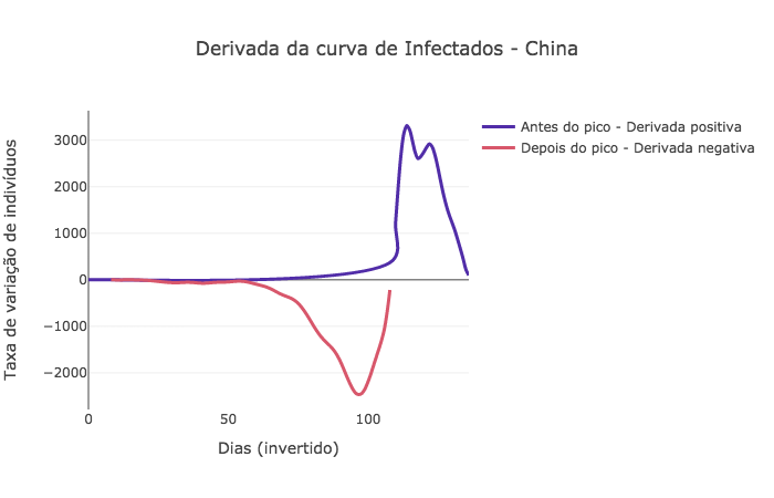
[22]:
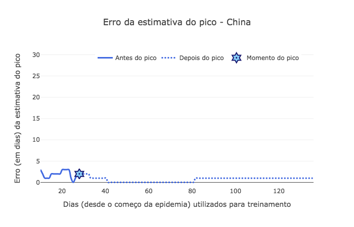
peak_pos = np.argmax(~signal[::-1])
print("O pico da epidemia acontece no dia", peak_pos)

final_day = int(td[-1])

estimated_peaks = []
for data in saved_prediction:
    dI = np.gradient(data[1][:final_day])
    signal_pred = np.array([di >= 0 for di in dI[::-1]])
    estimated_peaks.append(len(Id) - np.argmax(signal_pred))
estimated_peaks = np.array(estimated_peaks)
O pico da epidemia acontece no dia 28
[23]:
import plotly.graph_objects as go

peak_error = np.abs(estimated_peaks - peak_pos)

fig1 = go.Figure()
fig1.add_trace(go.Scatter(
                    x=td[start_day:peak_pos],
                    y=peak_error[:peak_pos-start_day],
                    mode='lines',
                    name='Antes do pico',
                    line_shape='spline',
                    line = dict(color='royalblue', width=3),
                    hovertemplate="Erro de %{y} dias, <br> com %{x:.0f} dias de dados."))
fig1.add_trace(go.Scatter(
                    x=td[peak_pos:],
                    y=peak_error[peak_pos-start_day:],
                    mode='lines',
                    line_shape='spline',
                    name='Depois do pico',
                    line = dict(color='royalblue', width=3, dash='dot'),
                    hovertemplate="Erro de %{y} dias, <br> com %{x:.0f} dias de dados."))
fig1.add_trace(go.Scatter(
                    mode="markers", x=[peak_pos], y=[peak_error[peak_pos-start_day]],
                    marker_symbol="hexagram-dot", name="Momento do pico",
                    marker_line_color="midnightblue", marker_color="lightskyblue",
                    marker_line_width=2, marker_size=15,
                    hovertemplate="Pico no dia %{x} depois do começo da epidemia."))

fig1.update_layout(yaxis_range=[-1,31],
                  template='xgridoff',
                  legend_orientation="h", legend=dict(x=0.20, y=1.0),
                  xaxis_title='Dias (desde o começo da epidemia) utilizados para treinamento',
                  yaxis_title='Erro (em dias) da estimativa do pico',
                  title_text="Erro da estimativa do pico - " + country['data']['name'])
# 'ggplot2', 'seaborn', 'simple_white', 'plotly',
# 'plotly_white', 'plotly_dark', 'presentation', 'xgridoff',
# 'ygridoff', 'gridon', 'none'

fig1.show(renderer="png")